The New Design of the Google Ads and Why It is a Masterpiece
Google has completed a fresh design update for its AdWords ads in recent months, and according to what is on the Google+ status of Jon Wiley, Google’s lead designer, the purpose of redesigning the ad’s display interface is to:
1. Enhance the ability to identify and create a clearer, more intuitive interface.
2. Bring a more even experience on mobile devices.
It’s good ads from Adwords are displayed the same on desktop as well as mobile devices such as phones. Google has made such great changes to the AdWords interface, its main monetization tool, which must have been thoroughly tested to ensure it does not affect the CTR of the ads. So when Google makes the change, we can believe that this new design is at least as effective as or better in bringing more CTR to the ads.
When it comes to designing ad templates like Google Adwords, the designer will have headaches because of the following criteria:
1. Making it clear that this is an ad and is different from the normal search results.
2. Properly designing and adjusting to avoid banner blindness.
3. Ads must be prominent to attract the attention of the user.
4. Ads must be in harmony with the color and overall design of the search page.
Looking at these criteria, we find that they are quite opposite and it is very difficult to fully demand all of these factors. However, Google’s new ad design has solve the above problems. Comparing between the old design and the new design of Google Ads, we can clearly see the difference:
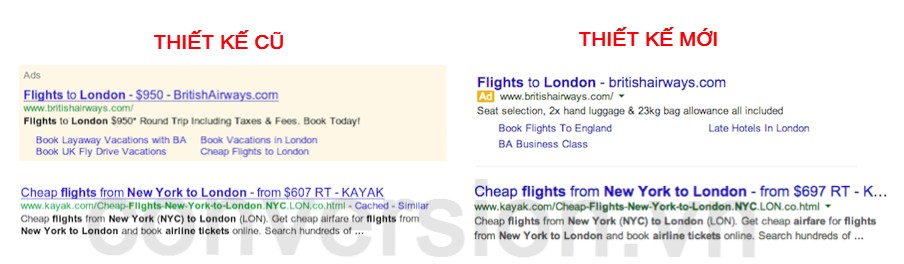
Comparing the old and new design of Google Ads
This new design of Adwords has the following significant changes:
+ Increase font size, attract more attention from users.
+ The color contrast between text and background is higher. Today is the letter on the white background compared to the blue letters on the background of Adwords (light red).
+ The Yellow “Ad” word increase the contrast but not too dazzling. This “Ad” appears in all ads.
What is the effect of this change? The following is a test of user behavior using EyeQuant’s eye-tracking technology to evaluate the effectiveness of new and old designs.
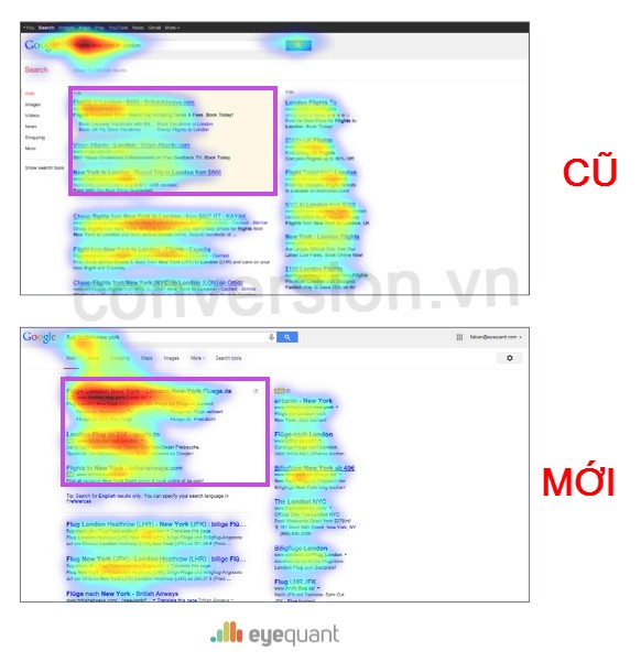
The results of the user’s attention check show that users pay more attention to the ads in the new design
By comparison, we can see that the new design gets more attention from the user than the ad space, especially the top 1 position. Needless to say, you know how profitable this is for Google. In spite of this, Google’s decision to redesign the Adwords interface is a wise move and at the same time it is a clear demonstration that design has a very important contribution to increase conversion if done properly.
About: Bui Quang Tinh Tu
CONVERCAST

ENOSTA [SPONSORED]

BUZZMETRICS [SPONSORED]

 Vietnamese
 English