 English
 Vietnamese
Mobile SEO and Optimizing Conversion Rate for Mobile
Mục Lục
This article is intended to inform you about an aspect that has not been paid enough attention to: optimization for the mobile version of the website. The optimizing here is not just about technical refinements or mobile SEO to increase rankings but also about improving user experience and increasing conversion rate. And at this moment, SEO and conversion optimization are very close together, and are all you need to do to enhance your user experience and interactivity on the web, thus deliver higher brand awareness, lower bounce rates, which result in more backlinks and indirectly lead to better rankings on search results.
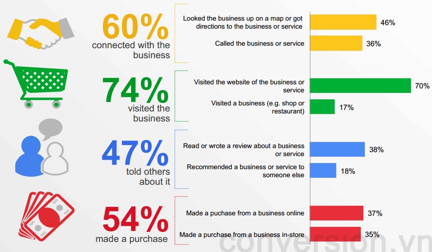
If you are still thinking that most people use cell phones primarily for taking phones, calling, taking pictures or checking-in Facebook, then you should probably think again. With the rapid development of the smartphones and tablets, 2014 is expected to be the explosion year for these mobile devices in Vietnam. According to Google’s “Our Mobile Planet” report, about 97% of users search for information on their mobile phones, and 54% of them have ever made a purchase on their phones.
Why are you still hesitating to GO MOBILE? Source: statista
Are these numbers enough to make you think of optimization and starting mobile SEO for your site or not? If you decide that it’s time to focus on mobile users and need a mobile website, be aware that a website has three ways to display phone versions to viewers:
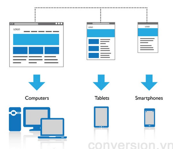
Option 1: Responsive design website, which can be displayed on all devices like computers, phones and tablets with the same URLs. Each URL on these websites will often have the same HTML code for all devices but CSS is used to change the way it is displayed for each device type. This is the most favourite way of search engines like Google and also the best for mobile SEO process.

Responsive design is the method recommended by the search engines. Source: theme-fusion
Option 2: Dynamic website serving to all devices on the same URL, but depending on the access device, will produce completely different HTML, CSS code and sometimes even the design. This is not the first pick for search engines, as the provision of different content depending on the audience has long been considered as negatively cloaking. If you have to do this then make sure you use the Vary HTTP header to provide both the user and the search engines the right web version based on that person’s accesing device.
Depending on the accessing device, the website will provide different HTML / CSS.
Option 3: There are two separate websites, one for computers and one for mobile sites separately. This is also a common solution and especially useful if the website is aimed at users who use old-school phones (not smartphones). Older phones often do not have the ability to process CSS, so they need to have a separate page for better display. If you use an isolated mobile domain and website, it is important to pay close attention to tagging and using “canonical” and “alternate” tags to avoid duplication of content, which will be discussed below.
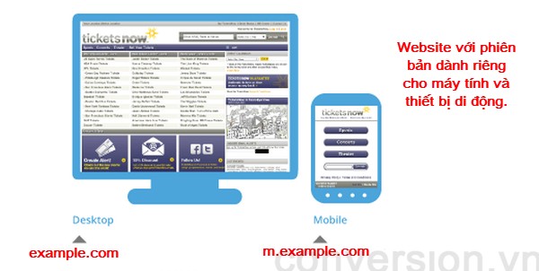
Create a mobile website that operates independently from the main website.
Common errors of mobile website
Mobile SEO is just another extension of the normal SEO technique, because the website for mobile devices is basically just an extension of the normal website and both should be just as 1, at least for Google (that’s why Google supports responsive design). Whether it is SEO for mobile or pure SEO, it must be based on the development of content for the website, improve the user experience and optimize the conversion rate. However, when conducting SEO for mobile website, firstly you need to pay attention to some common mistakes to ensure the mobile website is operating in the best way:
1. Incorrect redirecting
For example, redirecting to the homepage rather than the content page that customers want to visit. The wrong redirection can cause the user to leave, escalate the bounce rate, curtail the amount of time spent on the website, taper off the user experience. This also makes it hard for the search engines to crawl and index the site. Surprisingly, this is one of the most common misconceptions of mobile websites, especially websites in the third case, which use a separate website for mobile users. So be careful to ensure that your website redirects to the right place in between the two versions.

Redirect to the article home page instead of the article page on the mobile version
2. 404 Not found errors
Sometimes users are redirected to a 404 error page because their used device is mis-identified. For example, if a user is using a desktop computer or a laptop but it is mistakenly identified by the website as a phone and sent to a phone-specific page, the link does not exist or causes a 404 error.
3. Googlebot-Mobile Error
This error causes the mobile website to not be crawled by Googlebot. The main reason could be redirect loop, being blocked by settings in robots.txt or wrong markup / tag creation. This will affect the ranking of its mobile and mobile SEO sites.
4. Do not tag full version of normal website and mobile
Google needs to know that there is a link between the regular website and the mobile one. To do this you need to use the rel = “canonical” and rel = “alternate” tags. If you are a website owners from the third case above (separate site for mobile users), this is a must-have.
For example, you have 2 websites:
https://conversion.vn/mobile-seo-cho-website-di-dong (normal page)
http://m.conversion.vn/mobile-seo-cho-website-di-dong (mobile site)
On the normal page, there should be a rel = “alternate” tag to indicate that the other page is a different version of the current page.
<link rel = “alternate” media = “screen only and (max-width: 640px)” href = “http://m.conversion.vn/mobile-seo-cho-website-di-dong” />
On the mobile site, a rel = “canonical” tag is required to let Google know that the page is the original.
<link rel = “canonical” href = “https://conversion.vn/mobile-seo-cho-website-di-dong” />
This process is to help Google determine the relationship between the two sites, avoiding the fact that these two pages are duplicated content, which is harmful for the mobile SEO. A more detailed tutorial from Google about this.
Characteristics of mobile SEO
Once you’ve made sure the technical issues are resolved, you need to pay attention to some of the unique traits of SEO for the mobile web:
1. Keyword search
The biggest difference between a computer user and a phone user is the use of different keywords when searching for information. The development trend of mobile voice search is one of the major causes. For example, when looking for a service using voice, phone users will often use keywords like “nearest restaurant” instead of “district 1” or something. Another reason is that the phone always has the GPS identifying function, and always turned on while the computer is not. Therefore, when researching and selecting keywords, you should focus on this fact.
2. Length of the keyword
Also, when using the phone, typing is often not as convenient as typing a keyword on a computer, so users will often use shorter words, avoiding words that are lengthy.
3. Rank
Due to an attributte of the phone is that its screen is quite restricted in term of area so users will often have to scroll more if they want to see the lower information. And the user does not like scrolling. So the first three results on a mobile search results page will be almost the entire number of clicks of the keyword. So for mobile SEO, it’s important to be in the top 3, not top 10 or top 5.
4. Search results
Mobile search results often give preference to those services that are closer to a user’s location. Domains that contain keywords related to locations, sites in the Google Place listing will generally be preferred to show on search results. Therefore, it is important to register the service with Google Place, using the markup / schema location tags for the service to optimize the search results. Also in some keywords, images and videos will be given more priority when searching on mobile phones, so you should also consider about SEO for images and videos.

Google Place results are referred to be displayed in search results for location-related keywords. Source: Google
5. Personalized search results
On mobile phones, users will always have to be connected to a Google account and so the search results they see will usually always be personalized results. Therefore, the websites that they use often or the places they usually go to get priority in the search results.
6. Flash or Java – need attention
Some default browser versions of the older phone operating systems may not support flash, and Apple products such as the iPhone, iPod, Macbook, etc. do not support flash, and so will the future. Some phones can not operate Java, so avoid using Java when building a mobile website. Flash and Java can affect user usage and increase bounce rates if they prevent viewers from the content. So the advice here is to focus on using HTML5 / CSS3 for the mobile web version, which is better for Mobile SEO.
Optimizing the conversion rate on mobile website
1. Design
Design is one of the key factors in determining the success of a mobile website. Screen size and interactivity are different on computers and mobile phones, so when designing the interface of the mobile website should pay attention to these matters clearly. If the interface of the mobile website is not convenient, lacking visibility or incompatibility for phone users, it will certainly make them leave. Some things to keep in mind about designing for mobile website:

The interface for mobile is usually simpler and easier to operate than the PC version
Because the screen is small, you should pay attention to the buttons and links to make them clear, easy to operate. The email addresses are set to “mailto” so that users can easily send emails or phone numbers with “click to call” function to save them some time.
If the content is rather long then it should be designed so that the reader can scroll down to view, not horizontally.
Although mobile websites and computer websites may be two separate and distinct websites, they should also follow specific brand identity standards. This is very important because it helps the user feel they are on the same site, not like being pushed to another land and help them remember your brand longer. Brand identity can be complied with by following the standard colors of regular websites and logo templates.
2. Page load speed
Page load speed has a significant impact on the user experience on mobile web pages. According to studies from Nielsen, a mobile site should load in 1-2 seconds to provide the best user experience. If a website loads less than 3 seconds, it will make them jitter and after 10 seconds most users will leave the site. Currently the average speed of the website is about 5 seconds. If you can do anything to optimize your web site download speed even by cutting 0.5 or 1 seconds, you need to do it.
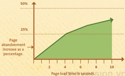
The longer the website load, the more people leave. Source: KISSMetrics
For Google, page load speed is one of the factors that affect the ranking of the website and it should be paid special attention in the aspect of optimization for the conversion and mobile SEO. One of the best ways to optimize your site’s download speed is to use the PageSpeed Insights extension from Google. This application will scan your entire website and give you feedback on how to optimize the speed of your site by compressing images, gather css files, etc.
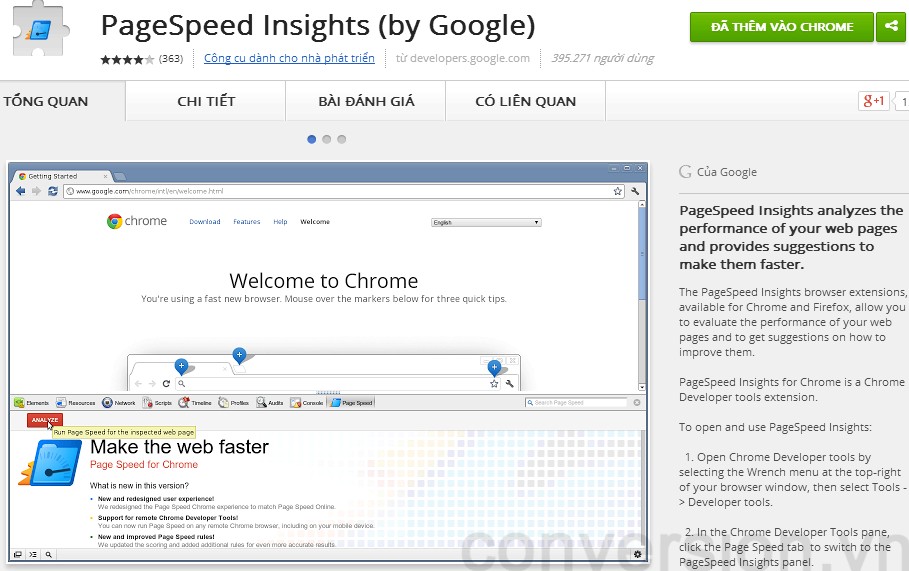
The application allows users to analyze their own websites and find out what needs to be optimized for a better load
3. Orientation and interaction within the website
Most people feel that web surfing and web browsing speed is slower than on a computer, so one of the important things you need to keep in mind is to minimize the number of pages to the simplest possible. . Users do not like to click multiple times to reach the content they need to search. Therefore, the website structure should be as simple as possible, allowing users to access information faster, easier. Users should not have to click more than 3 times to reach the page they want.
On the limited interface of the phone, navigating between pages, as well as between tabs, is more difficult than doing so on a computer. Therefore, if you have to load a new page on a new tab, your mobile website needs navigation and instructions to help users get back to the original page if they want the quickest way. Ideally, pages should have a home key and return to the previous page for easy access.

Minimize the user having to type too much on the phone keypad
Typing on the phone, even though having many improvements, still can not be as fast and comfortable as typing on the computer. So let’s add auto-suggest, auto-complete features to any content boxe possible so that the user would not have to press too much on the phone.
The above is just an overview of what you can do to optimize your mobile website for both conversion and mobile SEO. Depending on the type of website as well as the target audience, we may have different optimization orientations that the author will mention to in another article.
About: Bui Quang Tinh Tu
 Hien are is Director of Marketing Store Vietnam Ringier AG. Digital Marketing and passionate about sharing knowledge as expected những scraped past tense as multiple users of coal, I was quyết create conversion.vn blog. If need to contact me, please email as through [email protected]
CONVERCAST

ENOSTA [SPONSORED]

BUZZMETRICS [SPONSORED]